The lo k, the rules, the receipts.
The canonical source for how ScreamingFace looks and reads — one tokenized system, two registers: editorial marketing and load‑bearing product UI. Every element on this page renders from the system's own tokens.
We're shipping the leaderboard that proves fusion models beat any single frontier model — with a receipt on every score.
A claim like that gets judged by its surface before anyone re-runs it. So the system is built like an instrument, not a brochure:
- "SOTA is proven, not asserted"
- numbers lead — tabular figures, slashed zero, aligned to the decimal
- "anyone can re-run it"
- pages read like documents — real data, real labels, never lorem
- "the win is the story"
- one gold accent + the fusion gradient, spent only on the winning row
- "the community wins"
- the 😱 stays the people's emoji — never a corporate logo
We're arguing that AI should be honest. The surface should feel honest too.
start here
quick downloads
These are just the most-grabbed files — more assets live throughout the page below.











three colors carry meaning — and one gradient
Everything else stays black, white, and gray — charts run on the family solids — gold included. Full law: color.
say it like this
- headline test
- visualizable · falsifiable · specific — could a competitor say it? Then don't.
- proven shapes
- “Fusion models beat SOTA.” · “Results you can rerun, not just read.” · “The frontier isn't a model. It's a fusion.”
- CTAs
- See the board → · Reproduce it → · Read the method — verbs that name the action, never “Submit” / “Learn more”
- register
- marketing makes the claim (serif, gold) · product is the proof (sans + mono, blue). Full law: voice + type.
the icon
The icon is the screaming face, 😱 — screaming because the results make us scream, the people's emoji because this is public infrastructure, not a corporate logo.






- small sizes
- in text, UI, tabs, and chat, just type the emoji — 😱 is the icon there
- big sizes
- above ~600px — heroes, lockups, print — use the hi-res file (1900×2000 ↓), never a scaled-up emoji
- versions
- a typed 😱 renders however the reader's platform draws it — and all of those represent the project just fine. Our lockups and shipped assets happen to use the Mac-style rendering; when artwork should match them, use the files rather than typing the emoji
clear space
Minimum breathing room around the icon. Nothing — text, rules, other marks — enters this zone.
minimum size
Never render smaller than 16px — below that the icon degrades to a smudge.
48pxfeature · assetthe name
One word, camelCase: ScreamingFace — one unbreakable token everywhere the name travels:
screamingface.ai, the handles, the package prefix. In artwork it's set once, in the
wordmark files — never re-type it in a font.
using the icon
No one can own 😱 — that's the point. A standard emoji belongs to everyone: the people's mark, not a corporate logo. Vendors do own their specific artwork, so our display asset is our own rendering — never a lifted platform glyph.
Not legal advice — the short version: use it freely, credit no one, claim nothing.
lockups & downloads
Press-ready — both grounds, plus the wordmark alone.
- wordmarks
- outlined vector paths (Plex Sans Medium) — no font install needed, opens correctly in any tool
- icon
- embedded at web resolution (640px)
- over 600px
- swap in
sf-mark-hires.png(1900×2000), included in the package




favicon & app icons
The icon is the mark alone — browser tab, bookmark bar, home-screen. No wordmark at this scale; the icon has to read on its own, on light and dark.
Ascending display sizes on a shared baseline; the 180 is scale-reduced to fit and renders from the hi-res master so it stays crisp. Downloads are true-size transparent PNGs. The "on light" chip holds its light surface even in dark mode (token-driven), so the icon is proofed on both grounds.
social graphics
The account surfaces, as real downloadable files — one dark family: the avatar, the link-preview card, and the X cover.
profile imageThe mark on brand black, one square file for every platform. The built-in margin means the circle crop never clips it; the right chip proofs the crop.
link-preview cardWhat a shared screamingface.ai link shows — the icon, the domain, nothing else. The real file, not a mock.
1200×630 ↓ · @2x ↓ · regenerate from the source page
x cover
Three explorations, each a ready 1500×500 upload — pick one, or take them to the exploration page (live frames, crop + avatar overlays). Click any cover to preview it in place on the profile.
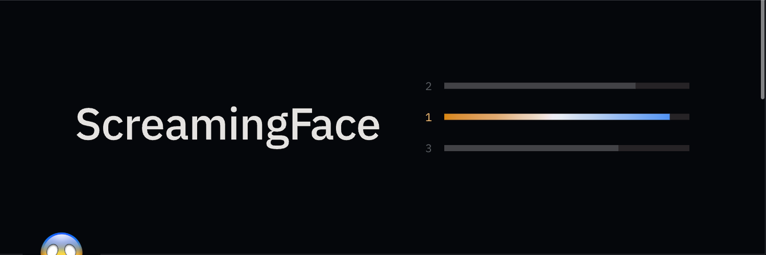 A · the field1500×500 ↓
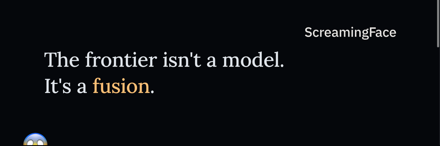 B · the claim1500×500 ↓
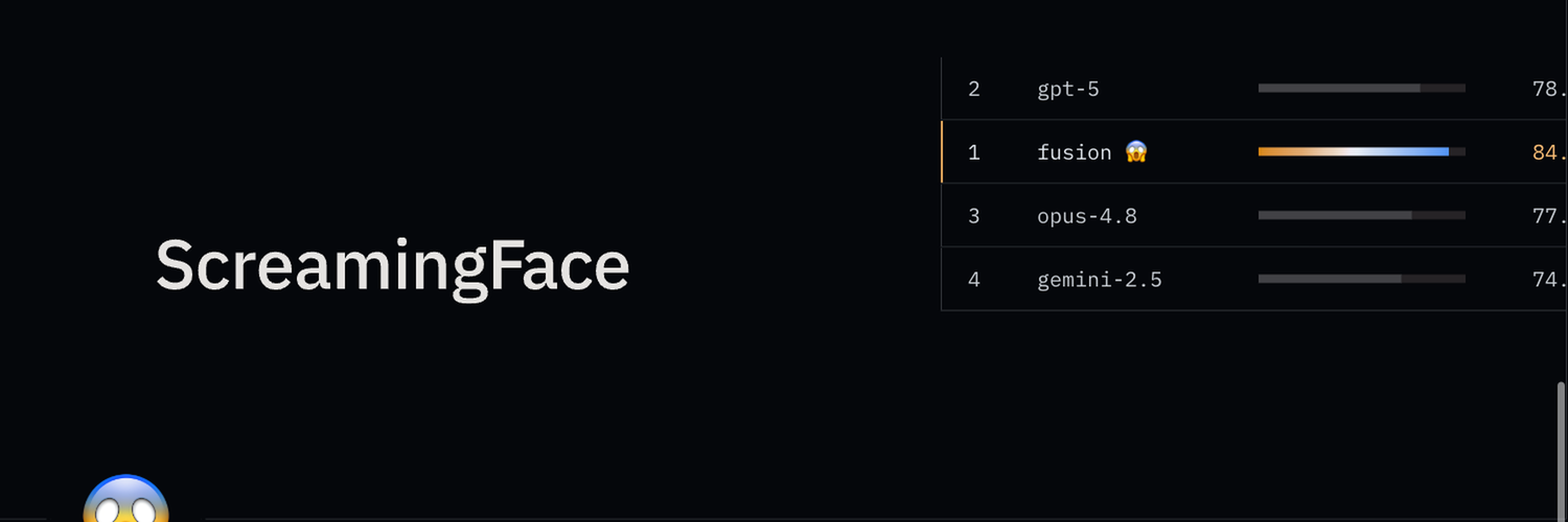 C · the board1500×500 ↓
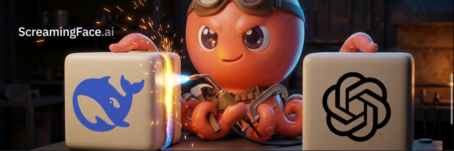 D · octopus fusion1500×500 ↓
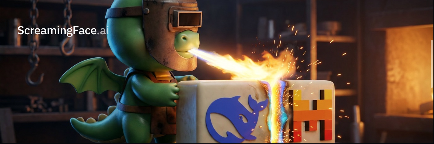 E · dragon fusion1500×500 ↓
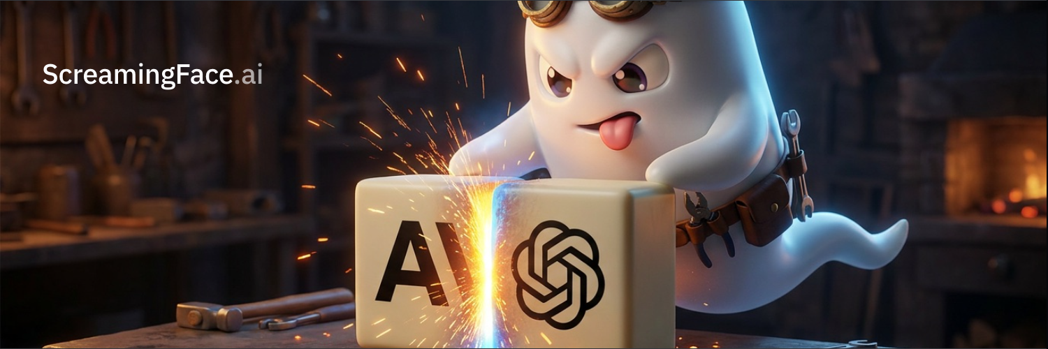 F · ghost fusion1500×500 ↓
color
color modes
Dark and light are both first-class — every color in the system resolves in each mode, so every surface ships both. A surface opens in whatever mode the visitor's device is already set to, and a subtle switch (◐, top right) lets anyone override it; the choice is remembered.
the fusion gradient
The winning fusion model tops the board — so the #1 row isn't flagged with a green badge, it is the brand.
- what it is
- gold fading into blue — the icon's own two colors, lifted straight from the face (
--fusion-grad) - where it goes
- the winning row on the board — and nowhere else
- why it's rare
- it's the only gradient in the entire system; everything else is flat color, so the win is unmistakable
- when it can't fit
- plain gold means the same thing — the win — on text, small marks, and thin rules where a gradient would smear (
--gain) - vertical
- an upright version exists for vertical accents, like the colored left edge of a winning row (
--fusion-grad-y,-y-flowfor seamless loops)
Hover the bar (or the #1 row below) — the gradient flows continuously on hover, static otherwise. The loop has no visible seam, and it respects prefers-reduced-motion.
Three layers, rendered live from tokens.json so this page never drifts from the
system.
- semantic
- what components reference — the only layer surfaces touch
- primitives
- the raw palette the roles point at
- categorical
- visuals that compare many things at once
primitive scales
Step-as-role: 1 bg · 2 surface · 3–5 component · 6–8 border/focus · 9 solid · 10 solid-hover · 11–12 text. Badges show each step's APCA result; dark isn't an invert (chroma −18%). Click any swatch to copy. Contrast is engineered, not eyeballed — checked on every build: text-low Lc 75, text-high Lc 90 — and every solid takes white text at Lc ≥58, so any solid can swap for any other without rethinking its label. One documented exception: gold text on light holds Lc 62 (forcing 75 turns gold umber). Text may only carry a contracted text role — machine-linted.
data visualization
Charts define no colors of their own: the seven series are the family solids from the palette above — gold included — in a fixed order that keeps neighbors tellable apart for everyone (color-blind included — checked, not eyeballed). Assign in order, never cycle. One rule rides with gold: when a chart draws the win in gold (the leading row, the SOTA mark), skip gold in the deal and take the next series. Need more than seven? Series 8–14 reuse the same solids mixed 55% into the ground, in the same order — the mix is also how related pairs read (actual = solid, forecast = the mix). Magnitude belongs to the sequential ramp, not to hue. A status color is never "series 4."
the palette in use
The point Ronnie flagged — how do these get used? Two jobs, two examples, both on this exact palette. Identity never rests on color alone (direct labels + marker shapes + a data table), which is also what lets the brightest series colors stay legible.
data table
semantic layer — product vs marketing
Same primitives everywhere — the only alias that changes is accent: blue in product, gold in marketing. Gain stays gold in both; neutrals and the status families are shared. Below, the roles wired into real components. Hover a button for solid → hover.
type
One system, two registers — rendered from the font tokens below.
- marketing
- Parastoo, a warm editorial serif, at hero and display sizes only — supported by Plex Sans
- product
- Plex Sans carries all load-bearing UI and body copy; Plex Mono takes data, labels, code, receipts
- never
- the serif in product UI chrome or dense data; the mono at display size
- wordmark
- Plex Sans, tight — medium at display sizes, semibold at rail size — the quiet, engineered counterpart to the mark
| token | family | used for |
|---|
the two registers
The same story, worn two ways: marketing makes the claim (serif, air, one gold moment) — product is the proof (sans + mono, dense, blue). Numbers are mono in both; gold only on the win. Flip the impression — both hold.
Fusion models beat STA.
A verified ensemble of models beats the best single model on the hardest benchmarks — and every score ships with a receipt you can re-run yourself.
scale
Eight sizes, each with one job. Everything on every page maps to one of these (rendered from the
text tokens).
| token | size | used for |
|---|
Receipts.
--text-hero · clamp(44–76) · Parastoo · --weight-display 500Receipts.
--text-display · 38px · Parastoo · --weight-display 500The look, the rules, the receipts.
--text-metric · 30px · Plex Mono · 600The look, the rules, the receipts.
--text-lead · 20px · Plex Sans · 400The look, the rules, the receipts.
--text-body · 16px · Plex Sans · 400The look, the rules, the receipts.
--text-sm · 13px · Plex Sans · 400The look, the rules, the receipts.
--text-micro · 12px · Plex Mono · 500The look, the rules, the receipts.
--text-label · 11px · Plex Mono · 500numerals
Data is set in Plex Mono with font-variant-numeric: tabular-nums
slashed-zero — tabular figures keep columns aligned, and the slashed zero disambiguates
0 from O in receipts and run IDs.
weight
Three weights carry the whole system. Hierarchy comes from weight and size, never from a second typeface.
do / don't
never
- Serif in product UI chrome, table cells, or buttons
- Mono set at display size
- More than two families on one surface
- Fake small-caps or stretched type
instead
- Serif = editorial voice, hero/display only
- Sans carries everything load-bearing
- Mono = anything a machine said — data, ids, receipts
- Weights make hierarchy, not new fonts
layout
Two widths, one spacing scale — this page is the demonstration.
- prose
- 760px column (
--col) — comfortable line length for paragraphs and lists - artifacts
- 1140px band (
.band) — viewport-centered full bleed for scales, specimens, galleries; can never overflow - spacing
- the 12-step
--space-*scale, from a 4px hairline gap to a 96px section break
elevation
Depth without drop-shadows: surface tiers sealed by hairlines — elevation reads from the seam, not a blur. Shadow is spent exactly once, on the one thing that genuinely floats: the terminal window.
- ground
--bg— the page floor; nothing sits behind it- panel
--surface— cards and panels, the default raised plane, sealed with--border- inset
--surface-2— wells, tracks, inputs; a step recessed, sealed with--border-strong- float
--shadow-window— the single elevated treatment, theme-aware (soft & cool in light, deep in dark). Used once: the terminal.
--bg
--surface
--surface-2--shadow-window
the fusion ground
The atmospheric background: warm and cool bleed from opposite corners and fuse at the centre — glowing in dark, deepening in light. Still until the cursor nudges it. Built only from --gain and --accent-solid.
iconography
UI icons are Remix Icon (Apache-2.0), self-hosted — no icon-font CDN dependency. The curated set below covers leaderboard chrome: comparisons, ranks, data, and system actions.
browse the full Remix set · 3,229 icons →
sizes
Fill-based (fill="currentColor") — set color, the icon
follows. Default size 24px (--ic). Apache-2.0, self-hosted under assets/icons/,
no external icon-font request.
components
The UI set, by name — every specimen renders from the real class, so this section is also a live integration test. The chip is the class name; reference components by it.
.btn--primaryboth
the loud CTA — --accent-solid fill, gate-solved contrast text; goes gold + sans in marketing (below)
.btn--secboth
outline tier — label matches outline, hover = the family tint. Accent only here; gold is marketing-only
.btnboth
ink fill (inverse-on-ink) — the neutral base; inverts to its own outline on hover
.btn.ghostboth
muted at rest (--line-2 outline · --ink-2 text — never a bright frame), brightens on hover
.btn--linkboth
the lightest rung — blue underline, no box
.sm / .lgboth
three tiers on any variant, either register: .sm matches an input (toolbars) · default (product chrome) · .lg the hero tier (CTAs)
The same classes, worn the marketing way:
data-brand="marketing" on the surface flips the accent alias to gold (tokens.css) and the
action type to sans (the editorial voice). Nothing below is a new component — the register is the only variable.
.btn--primary.lgmarketing
the hero action — gold fill, sans semibold; size via .lg (register and size are independent axes)
.btn--secmarketing
the outline tier is gold by default here — the register supplies it, so there is no gold modifier to apply
.btn.ghostmarketing
still the muted neutral — quiet actions don't take the accent in either register
.btn--linkmarketing
gold underline, sans — the editorial in-flow action
.field.ddproduct
.fieldproduct
same anatomy for typed entry — the shared underline goes accent while editing
.tabsproduct
.checkboxproduct
the one toggle — drawn square, accent fill + geometric check when on
.statusproduct
.badge.badge--okproduct
.sq) + label
.badge--ok / --badproduct
.gl) on the status-theme recipe
.markboxproduct
.sm 14px) — fixed-pixel glyph, dead-center by construction
.badge-verifiedboth
.badge-sotamarketing
wave-mark.js)
.table-wrapboth
| rank | backend | acc |
|---|---|---|
| 1 | ensemble-3 | 83.1% |
| 2 | claude-opus | 80.4% |
--gain
.th-sortproduct
--static for non-sortable columns
.score-cellproduct
.grad), a leading single carries its maker's color (.brand)
.model-icoboth
--m) — they sit in the ink ladder instead of shouting their own palette
.chart-cardproduct
.flush for edge-to-edge tables) · mono footline; composed in full in examples
.kvboth
- register
- product
- accent
- blue
.kickerboth
.noteboth
the elevated fixed-chrome surface
$ prompt
.statsmarketing
.gain
.deltawrapmarketing
.climbmarketing
fusion-ground.jsboth
[data-fusion-ground] (or the page body) and floats the two fusion orbs behind the content. Live render in elevation → the fusion ground..bleed = full-bleed with runway
Rules the product register enforces: square corners everywhere
(--radius-none; the window chrome is the sole exception), elevation by surface +
hairline — never drop shadow, focus via --focus ring, and gold spent only on
the win (the leading row, the SOTA counter). Components marked product were proven
on the SDK-widgets surface before promotion; marketing components carry the
gold/serif register; both flip their accent with [data-brand].
examples
Components, composed — the assemblies teams actually ship, rendered live from the classes above. Copy the markup; every part is a real system class, so an example here doubles as an integration test the same way the registry does.
.chart-card + .th-sort + .score-cellproduct
.th-sort; the benchmark switch is a .field.dd
view markup
.chart-card + --data-*product
view markup
The other social surfaces live with the identity assets:
the X cover source (add ?guides for the display hazards) ·
the OG / social card · the profile image.
surfaces
Where the system lands: the real products, re-skinned onto SFDS. Every card opens the live, interactive thing — not a screenshot.
- two registers
- surfaces split by audience — a public register (marketing energy: the leaderboard, the scoreboard) and a technical register (denser, tool-like: the studio). Same tokens, different voice.
- proof surface
- each surface is an acceptance test for the tokens — re-skinned in place, still fully interactive; if it holds up here, the system holds
- round-trip
- when a surface needs a value the system doesn't have, the fix goes into the tokens or components, never a one-off (the verified pill + data-table earned their way in this way)
- one story color
- gold is rationed to the win — the leading row, the SOTA counter; green marks verified/reproduced; blue is interaction. The three never compete.
Live today: screamingface.ai (leaderboard) · scoreboard.screamingface.ai (receipts) ·
this guide. Next onto the system: the studio (research client) and the docs site.
 public · iterating
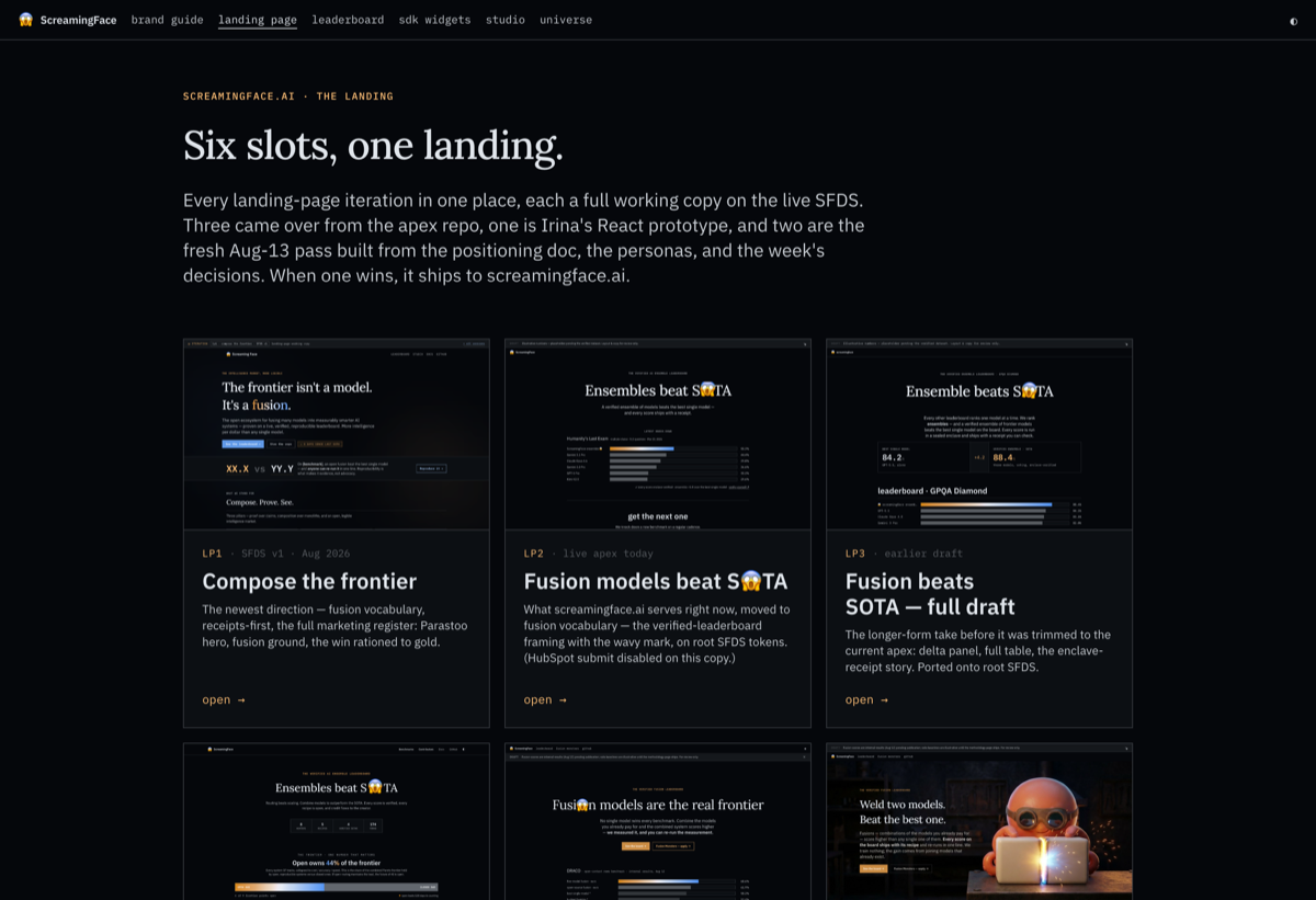
screamingface.ai
The landing — now an iteration hub with six slots. Every version in one place on the live SFDS: the SFDS-v1 direction, the apex that's live today, the earlier full draft, Irina's React prototype, and two open slots for what's next. One wins, then ships. open the versions →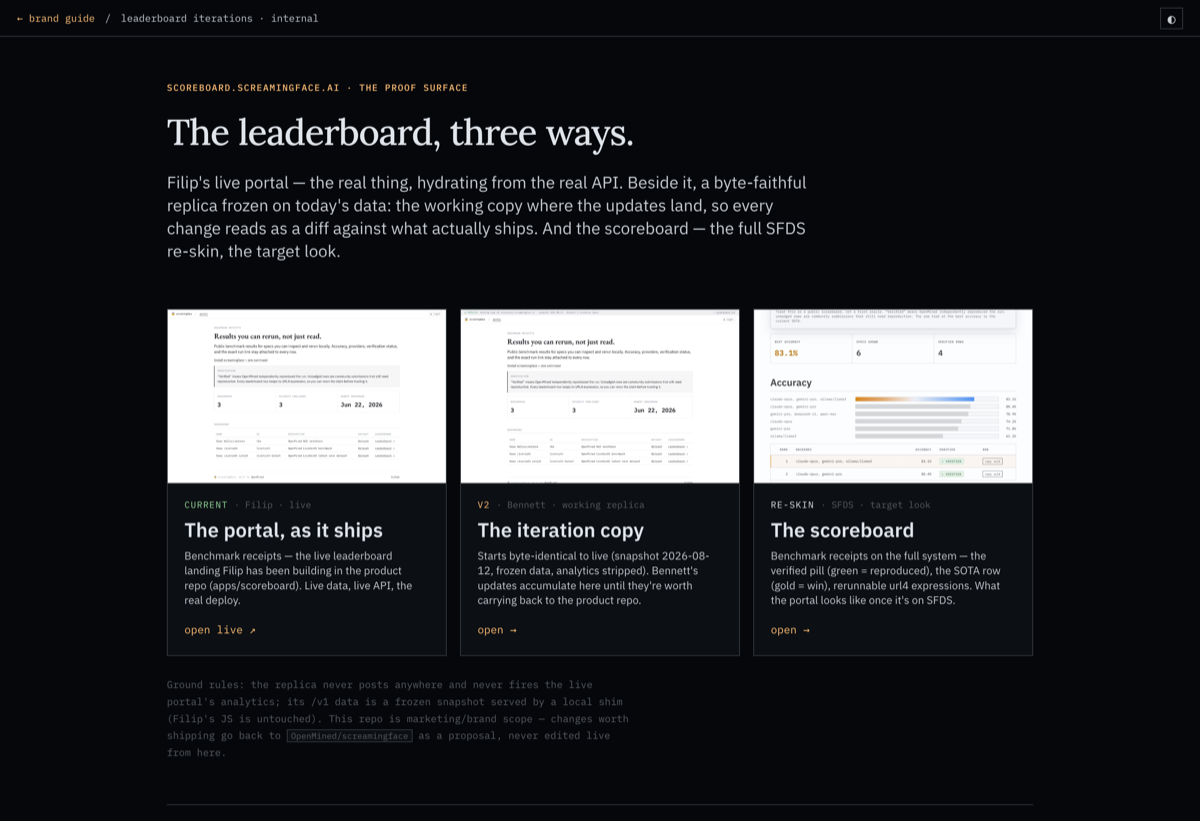 public · iterating
the leaderboard
The proof surface, three ways: Filip's live portal (the real deploy, real API), the byte-faithful v2 replica on frozen data where the next round of updates lands, and the scoreboard — the full SFDS re-skin showing the portal on the system. open the versions →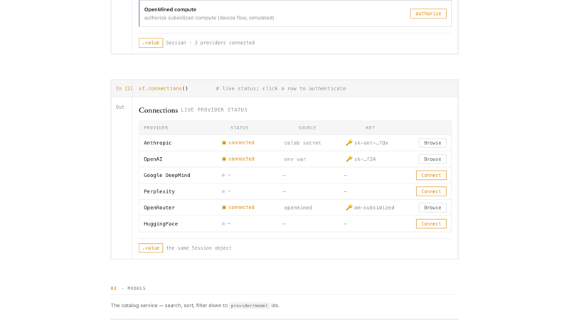 notebook · spec
the SDK widgets
The programmatic front door — ten interactivescreamingface notebook widgets (setup, browse, compose, run, leaderboard) framed as live cells. The technical register in Jupyter/Colab; the target look & behavior for eng.
open →
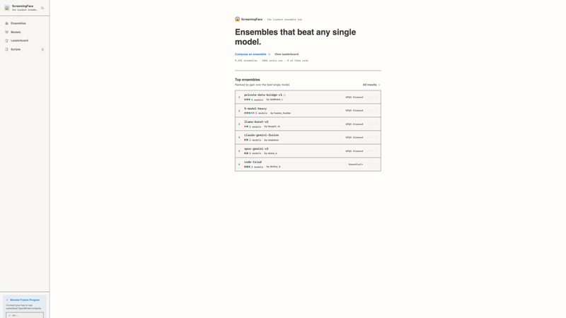 desktop · live
the studio
Model Ensemble Studio — compose fusions, browse models, run scripts, submit to the board. Full app shell on the product register, light and dark. open →the universe
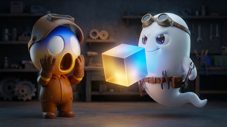
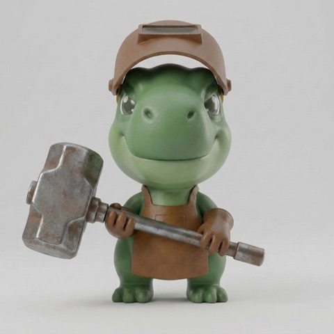
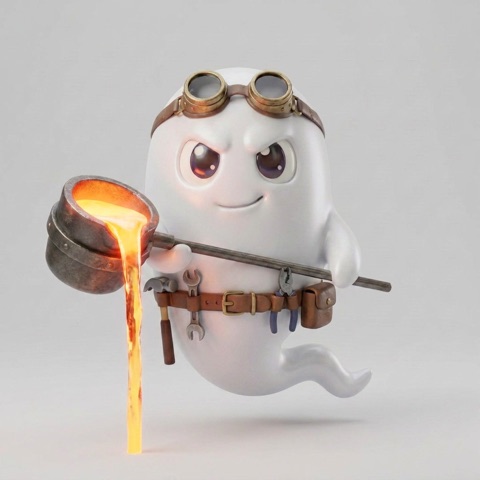
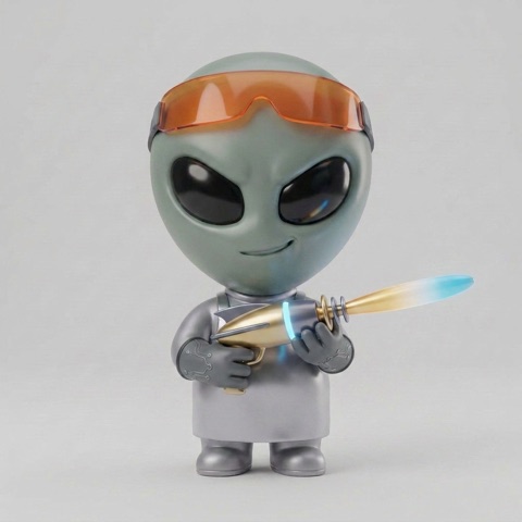
The cast of ScreamingFace — the makers, the fusions they build, and the scenes between them. The world that grows out of the icon lives on its own page.

model logos
The board names the models it ranks — nominative use only, identifying which model produced a result, never implying endorsement or partnership.
- integrity
- each mark stays exactly as its owner ships it: no recoloring, no distortion, no ScreamingFace styling on someone else's brand
- matrix
- per provider: color and derived-mono, each on light and dark — any surface pulls the right variant without guessing
- mono chips
- derived (filtered from the color source), not an official monochrome mark — no provider in this library ships one
- library
- 59 providers at
assets/model-logos/; the 30 below are the ones this board cites most








































Nominative use only · don't recolor or distort · no implied endorsement · each mark © its respective owner. Mono chips are derived (filter-based), not official monochrome assets. Three providers here (Stability AI, ElevenLabs, Midjourney) ship no wordmark asset in the library, so the icon substitutes with a set-in-system-font name; Reka ships no icon, so its wordmark stands alone. Full library: 59 providers.
voice & language
Per OpenMined's content guidelines: concise, credible, helpful. We write to be useful, not to sound impressive. Two archetypes — the Innovator (visionary, alleviates fear of the unknown) and the Citizen (integrity, fairness, values over profit).
| do | don't |
|---|---|
| Lead with the outcome, then how it works | Overclaim or speculate |
| Show receipts — numbers, links, names | Buzzwords / corporate jargon |
| Plain language; define acronyms once | Fear-based messaging |
| Center the reader and the outcome | Center ourselves |
Titles must pass four tests: can you visualize it, is it falsifiable, could anyone else say it (if yes, too generic), is it true. Draft 5–10 before choosing.
capitalization
One default, two scoped devices. Sentence case is what keeps us legible; the devices are the brand's typographic accents, kept on a short leash.
| role | case | where |
|---|---|---|
| Default | Sentence case | buttons, titles, body, tooltips, form labels, empty & error states — first word capitalized, proper nouns keep their case |
| Label | UPPERCASE | eyebrows, section & group labels, table headers, kickers, the component chips, the standalone status badge (a one-off pill) — mono, tracked, ≤3 words, always via CSS text-transform (never typed) |
| Machine | lowercase | code, SDK/API names (sf.setup()), env vars, ids, receipts, the .value line, the screamingface handle/domain — match the real casing |
| Canonical | as-branded | proper nouns never get re-cased: ScreamingFace · Fusion Monsters · OpenMined · provider names (Anthropic, OpenAI, …) · benchmark names (DRACO, MMLQ) · url4 · Syft |
Why sentence case as default: it skims faster, reads friendlier, and it's what the modern reference systems standardized on. Why caps stay short and CSS-only: all-caps costs dyslexic readers 13–18% reading speed and can make screen readers spell words out — safe only for tiny labels. So a status that repeats — a table column of them — drops the caps: sentence case, the word in the table's own text color, and a colored square carries the state. Caps are for the one-off badge, not the column. The lowercase section headings in this guide are the other deliberate exception — a quiet-heading device. And a genuinely subtle, non-actionable note — a whisper like a disconnected placeholder — may go lowercase and one step fainter than muted text; that's deliberate de-emphasis, not licence to lowercase a label or an action.
To codify here: the ScreamingFace register (brand-separated from OpenMined), canonical product terms (fusion models, never a synonym; staff builds named like hive-1), and the claim gate — SOTA/reproducibility/cost/speed language ships only as approved in the launch claims table.
the work
The flagship is the demo page Max would actually walk through. The three lettered pages are the visualization explorations behind it.
| page | what |
|---|---|
| demo → | honest-agi-live — the full Max demo page |
| A | The Climb — accuracy across the 4 stages |
| B | Pareto — accuracy × cost frontier |
| C | Before / After — the one big delta |